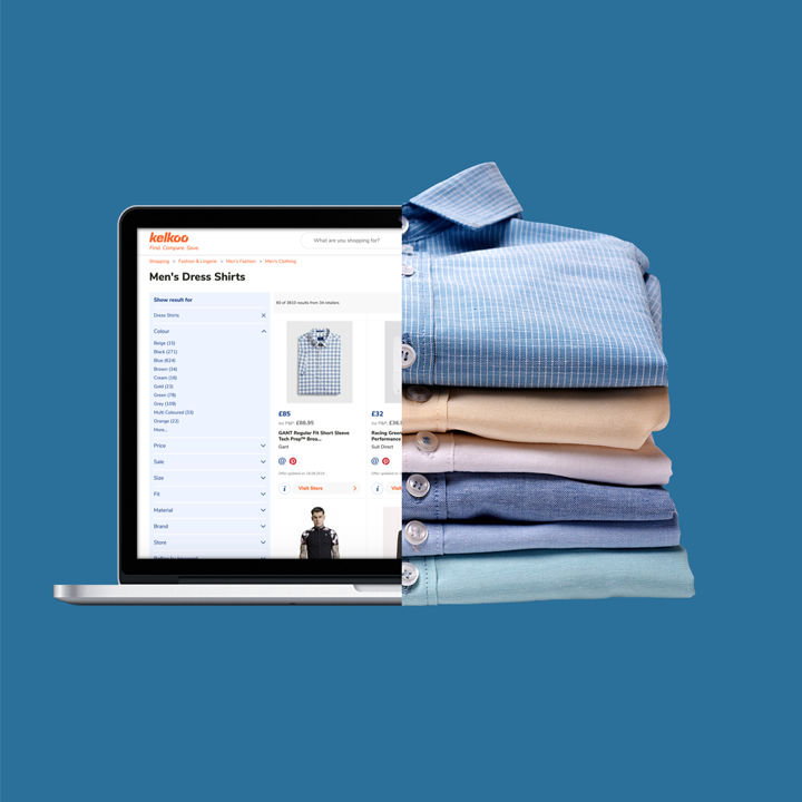
We connect merchants to consumers
Grow your business and receive incremental e-commerce leads to your online shop


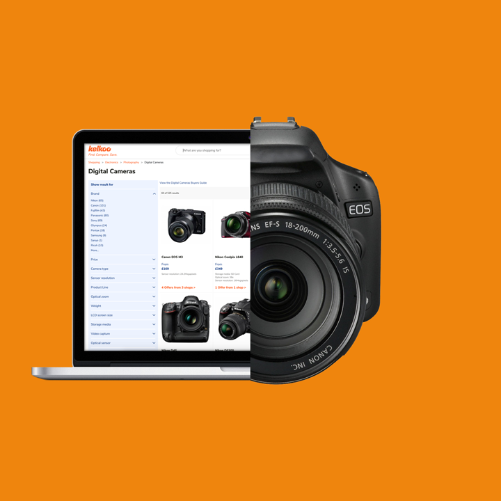
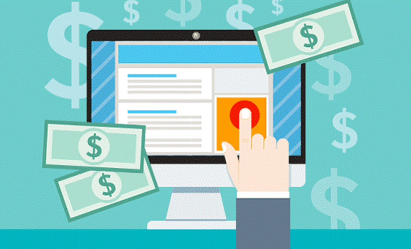
We connect publishers to products
Monetise your audience with our Publishers’ solutions

We connect agencies to audiences
Access scalable solutions for your clients and make the most of your performance campaigns


The power of Kelkoo Group
- 39
Countries
Global presence
- 10K
Merchants
Trust Kelkoo Group
- 350M
Clicks
Generated annually
Case studies
With 20 years of experience in e-commerce, digital advertising and consumer analytics, we are trusted all over the world by merchants, publishers, agencies and e-shoppers for the quality and performance of our services


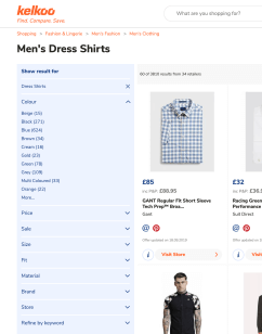
For merchants and agencies
For merchants and agencies
For merchants and agencies
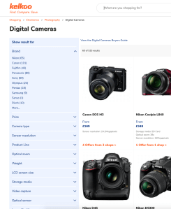
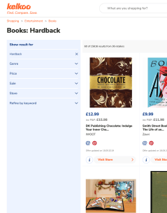
For publishers
For publishers
For publishers


Gain the latest insights
with our e-commerce guides
Looking to learn how to monetise your website and drive e-commerce sales?
In our Kelkoo Group Guides we share top tips for both merchants and publishers.


.svg)